Good stories worth visualizing. What about thousands of ignored striking stories that were never told?
This visualization started with my pure curiosity of the story that the data set describes — death of refugees. It was done before the inclusive immigration policy was practiced throughout west EU as we see today. By that time, the viral news coverage of the red-cloth boy casualty on the beach has drawn huge public attention. Looking into the data, you can easily find that the boy dead on the shore is just a tip of the iceberg.
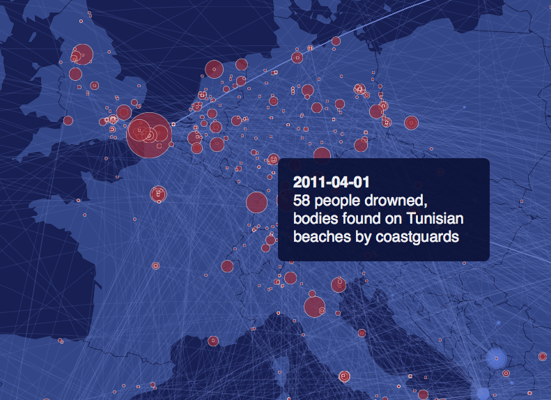
In this, every red circle is a tragedy that cost lives. The size of it represents the number of death. Arcs march before the circle is the origin of the victims.
This web graphic rendered over 7000 dom elements including about 2700 arc lines and twice as many circles to tell this story of indescribable mass life loss. The picture above is only a cropped corner around the EU region. You may want to find out more in the following link:
Click here to see it in the browser.