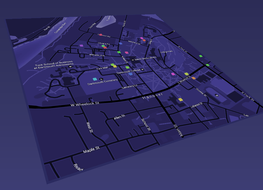
It turns out that you are not the only one who skips classes.
This original raw data set contains various activities of college school students in a time frame. In order to find out the potential correlation between the stress level and their decision making tendency toward class cancellation. A small data set focusing on the cancellation location and time in a one day interval was subtracted. Each entry was tagged with a unique uid to spot multiple class skips in the same day. Even though a lot of the less important feature like comments were boldly ignored, I was immediately encountered by the problem of how to represent multivariate data (time and space in this case) in a self-explanative manner.
The intuitive answer is using 3D space and animation so that I can have one more dimension in space and an extra dimension to depict the timeline changes. So I did, but the result is a fancy 3D animation without very much of the usability. The capacity to derive insightful evidence was largely sacrificed for the presentation appeal.
But as an experiment, it was a successful one. I learnt a lot by designing instead of just reading other people's experience. The deliberate selection of dimensions and trade off between visualization complexity and usability can be extremely tricky visualization design challenges. Pinning down these problems early can drastically remove the necessary uncertainty in later stages.
Click here to see it in the browser.